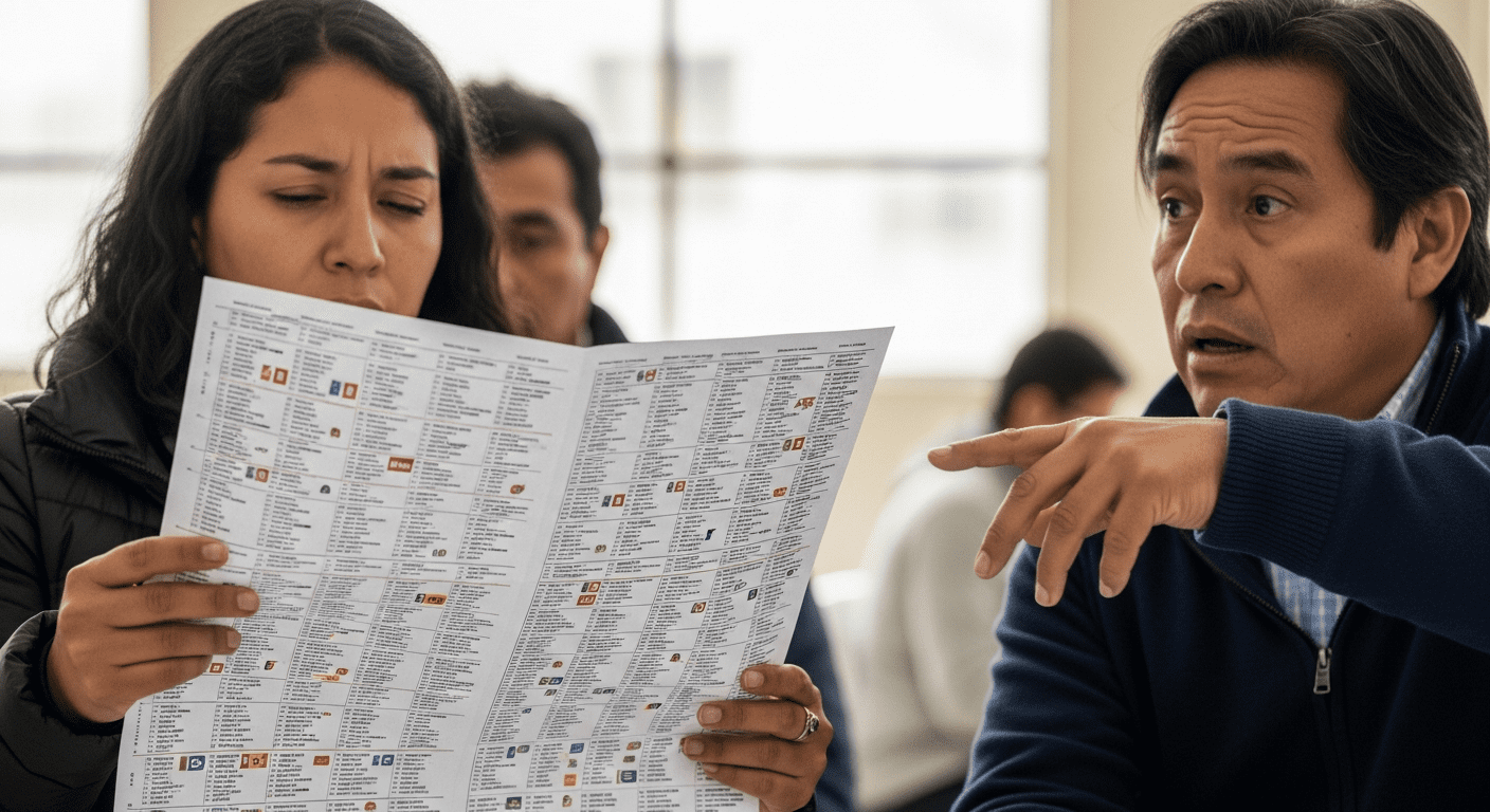
Ever opened a streaming service and felt paralyzed by choice? Now imagine that, but instead of movies, it’s potential leaders of a country, and the menu is a single, non-scrolling piece of paper. Welcome to the user experience of a Peruvian presidential election, a logistical marvel that makes you wish for a search bar in the voting booth.
The User Interface From Heck
From a pure design perspective, a ballot with dozens of candidates is a usability nightmare. The primary user goal—casting an informed vote—is hampered by overwhelming cognitive load. There’s no negative space, no intuitive grouping, just a wall of names and symbols that looks less like a democratic tool and more like the terms and conditions you scroll past without reading. You half expect to find a “Select All” checkbox somewhere at the bottom, just for the chaos of it all.
If Ballots Had Patch Notes
If we were to treat this democratic document like a piece of software in desperate need of an update, what features would we request in the next patch? The user community (aka the electorate) might suggest a few things:
- A Search Bar (Ctrl+F for Freedom): For when you remember your candidate’s name but can’t find them in the sea of faces. Bonus points if it supports autocomplete.
- Filter & Sort Options: Imagine filtering by “Has a Plan for Traffic” or sorting by “Least Controversial Pet.” The possibilities are endless and slightly terrifying.
- An “Are You Sure?” Pop-up: A helpful confirmation before you accidentally vote for the guy whose entire platform is just “more pigeons in public parks.”
- A “Save for Later” Button: For those of us who need to step outside, take a deep breath, and consult three different Wikipedia articles before committing.
Of course, democracy isn’t an app, and we can’t just ship a new UI. But the analogy highlights a real challenge. When the process itself becomes an obstacle, it’s worth asking how we can make participation less like navigating a cluttered spreadsheet and more like making a clear, confident choice. Until then, Peruvian voters deserve a medal for navigating the most challenging user interface of all: their own election.
Leave a Reply